Table of Contents
1 Introduction
*2 Problems
*2.1 Window management
*2.2 Help system
*2.3 Consistency
*2.4 Other
*2.5 Main Window
*2.7 Windows Relating to Play Functionality
*2.7.1 Conference Browser Window
*2.7.2 Conference details window
*2.7.3 Select the media and their sources window
*2.7.4 New media details window
*2.7.5 Play window
*2.8 Windows Relating to Record Functionality
*2.8.1 Record Window
*2.9 Documentation
*2.10 Tasks
*2.11 General comments
*2.12 Software Bugs
*3 Summary
*4 Recommendations
*5 References
*
Appendixes
1 Evaluator Report
*2 Evaluator Report
*3 Evaluator Report - PC
*4 Evaluator Report
*
This report contains the results of an evaluation of mmcr. The report is based on two separate evaluations:
The report contains three sections:
Window management
Help system
Consistency
Other
Main Window
Windows Relating to Play functionality
Conference Browser window
Conference details window
Select the media and their sources window
New media details window
Play window
Windows Relating to Record Functionality
Record window
Documentation
Tasks
General Comments
The aim of this report is to assess the usability of mmcr and to provide pointers to changes that would improve the usability of the tool.
New windows and dialogue boxes always appear in the top left-hand corner. Each new box obscures its predecessor. This predictability is an asset but having to move windows, e.g. help windows so it is possible to see the help window and the mmcr window that the help window refers to, can be an irritation.
If the user chooses to move windows to somewhere else on the screen, new message windows can easily be overlooked as they appear away from the main application windows.
Behaviour of message windows containing help is not consistent. Some help message windows must be dismissed before the user can carry on with her task, others can be left open.
It is evident that an effort has been made to prevent errors, to provide helpful error messages, to give feedback to users. Much of the labelling is also in clear English and makes the function of a window or button clear. However, further work, including a careful analysis of the language used, is needed to make this consistent.
For example: Too much information is given in too short a space so that it sounds incoherent. And also the user must hold a series of instructions in memory - or refer back repeatedly to the HELP menu in the main window. To give all instructions in one go also involves referring to dialogue boxes and buttons that the user has not yet seen at the time help is sought.
The help text is sometimes not precise when referring to buttons. For instance, in the HELP menu’s Recording option, there is a reference to the recorder’s ‘record’ button. In fact the button is labelled Start Recording. In the main window, still visible at this stage, there is a Record button. This could result in confusion.
Help is accessed via a menu. On the main window this offers help on Startup, Recording, Playback. Help is also available on some of the pop-up windows that appear during the record and playback process. This is an approach which ought to help users because it provides information at the moment when they are actually using a given part of the interface. To work really well, however, it needs to be consistent: all the windows should have this feature. This is, in effect, like providing balloon help, and some users might find such a two-level help system more useful than what is provided at the moment - with balloon help as the first line and more detail available via menus.
A review of what information is needed, and when, would also be a good idea. Is it necessary, for example, to refer to the ‘connections list’ under Startup, when at this stage the list would probably be empty?
There is also a tendency to assume knowledge that the user may not have: for example, the maximum number of recorders and players is specified, but without explaining the basic idea that mmcr consists of these objects.
‘Standardisation’ is a key HCI principle to increase interface comprehension - there are some problems here:
More specifically, functionality which appears both in the play and the record part of mmcr should look alike in both parts. The Record window has one button Start Recording which, when pressed, changes names to Pause Recording and if that is pressed, it changes name again to Resume Recording. The Play window has got three different buttons, PLAY, PAUSE and REWIND. Why not have separate Play and Pause buttons in the Record window as well? Or have two buttons in the Play window, one that changes names from Play, Pause and Resume Play and one called Rewind?
The concept of having Player(s) and Recorder(s) seems like a good one and easy to grasp. It is not, however, reflected in the labels on the windows - which read Record and Play. This is a possible obstacle to user understanding of the tool. And whilst Record brings up a Record window, Play brings up a Conference Browser. This is not simple to solve, but making the names reflect the design might help.
It is assumed that words like ‘media’ and ‘source’ will be interpreted correctly by the user. This may not be so for someone new to this field. In addition, Add media option in the Recorder and the Proceed button in the Player both bring up a dialogue box labelled New media details. These boxes look very similar. This could lead to confusion since many users may not see the processes (selecting and giving addresses for the media to be recorded and giving the destination addresses for playing back each medium) as being the same.
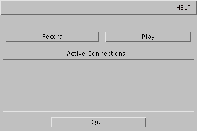
Figure 1: Main Window
The two main functions are presented nice and clearly. Good presentation of an exit button in clear view
On the face of it, the first window is well designed. The three buttons and the menu together represent the four tasks that the user is likely to want to make use of: Record, Play and Quit and Help. However, it turns out to be more complicated than that. It is possible to record and/or play up to six different sessions at any one time. Hence the Active Connections box which will list the various sessions being recorded or played. Pressing Play or Record will start up individual little record or play windows. This means that if the user chooses to play, she first has to press Play in the main window and then, once she has chosen which conference to play and which addresses to play it on, she gets another window which contains a play button. It is not at all obvious which of the play buttons to press to start the playback. The problem is that it is not clear that the main window is only there to allow the user to start up recording tools or a playback tools which then take on lives of their own.
The sequence of actions is longer for play than for record - unlike a home VCR. This is because as well as selecting what to play from the list of conferences, addresses and ttl have to be specified for playout. The tool’s flexibility adds complexity too; being able to select only certain streams to play back adds another stage and means that you cannot simply choose your conference and then play it. For some users this flexibility may not be needed. The number of choices makes the process more complicated than it needs to be and makes navigation harder.
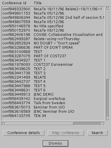
Figure 2: Conference Browser Window
This window contains a scrollable list of conference id/Title pairs. The aim of this is presumably to help the user select the correct conference. If this is so, then all the information displayed ought to help the user to identify this. Conference id is a label assigned by the recorder and is in a form that is not easy for a person to memorise or to distinguish (conf863287079 and conf 863434927 are examples). There is no apparent order of the conferences in the list. It would be useful to have them listed in some recognisable order.
Search is case sensitive. Maybe it ought not to be.
Result of the search is another conference browser, containing a modified list. One button is different; Search has become Undo search (quite a good way to indicate status - but an odd concept when you first come across it - possibly Show full list might be clearer).
From here you can select conference details - as with the first conference browser. Doing so sometimes gives you an error message, saying that you need to select a conference from the list. This happens (correctly) when you have not previously selected one and at times when you have. Undo search takes you back to the full list (in a smaller window!).
Whatever you do, eventually you have to select the Conference details button. Why does the Play conference button (greyed out) never become available?
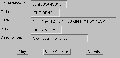
Figure 3: Conference details Window
The Conference details window has three buttons: Play, View Sources, and Dismiss. Pressing Play and View Sources produces nearly the same window, a window listing the sources and the index numbers of the media streams. The only difference is that View Sources only allows the user to view the sources and she must return to the Conference details window, whereas the Play will allow the user to select media streams for playback. The View Sources option seems unnecessary, in view of the fact that the user is forced to view sources anyway when she selects Play.
When Play is selected the player disappears (disconcerting - the user is left wondering if something went wrong - but probably a good idea as there were four windows visible.)
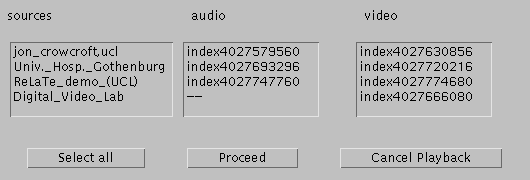
Figure 4: Select the media and their sources Window
The Select the media and their sources window enables the user to select the media streams that she wants to play back. The information is clearly laid out in columns and where possible the ‘sources’ are given as person-names, which is helpful. Select all seems to highlight all the sources. If she wants to select them herself, she can click on the name, to select all media from that source, or she can pick her way through the boxes to choose the streams she wants. It is assumed that the user knows it is possible to replay only some of the streams.
To be sure of seeing all the media streams available it is necessary to scroll. This is a possible source of errors, particularly where the various sources are using different numbers of media (for example, where one or two are not sending video).
It would be nice for the user to be able to reverse step through this process to allow for changes of mind. This is not always possible. When she selects Cancel playback she is returned to the start of this process; that is, only the main mmcr window is visible and she has to begin again by pressing the Play button - she has to create a new player. It is, however, possible to deselect a media stream, by clicking again on the item. This is a useful feature, though it is one that did not always seem to work at first.
Again, the windows does not tell the user what to do. The window has three buttons: Select all, Proceed, and Cancel Playback. Clicking Proceed without choosing any data streams causes a window to pop up explaining that data streams have to be chosen in order to proceed.

Figure 5: New media details Window
Once the data streams have been selected and Proceed has been chosen in the Select the media and their sources window, New media details windows pop up, one for each of the media that are to be played back. The address, port and ttl for each medium must be entered. It is not reasonable to expect the user to know what these mean. And to some it might seem that the same information is being requested yet again. There is no information to tell the user what the addresses, ports and ttls are and where she can find more information. The language used in these windows presupposes intimate knowledge of multicasting. If an invalid multicast address, for example 22.2.2 is entered, the error message tells the user that ‘‘22.2.2’ is not a multicast address’. It does not say what a correct multicast address is.
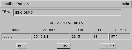
Figure 6: Play Window
The Play window has three buttons: PLAY, PAUSE and REWIND. Furthermore it has three menus, one for adding and muting media, another for hiding the Play window and quitting and the last is a help menu. The buttons are greyed out when it does not make sense to press them, i.e. unless PLAY has been pressed, PAUSE and REWIND cannot be chosen. Why are the labels written with capital letters? And why is there no STOP button? This is the third time that the user encounters a play button. How is she to know that this is the final one? Play is not a good label for the first two instances, in the main window and in the Conference details window.
Quit should have been a separate Cancel or Dismiss button somewhere in the window rather than option in a menu. It is not clear that choosing Quit will only quit this particular instance of a player and not the entire application.
The screen gets crowded during the process. At one point there are four windows on the screen.
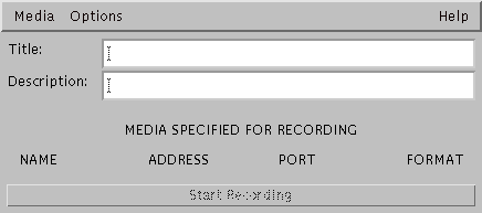
Figure 7: Record Window
The Record window starts up indicating that the user must fill out two fields called, Title and Description. Once these have been filled out, a New media details window (very like the one in the player) pops up and the user must enter Media name, Address, Port and select Data Type. When the media has been entered (if the user gets that far) the details are displayed in the Record window, and there is no indication of further steps to be taken in recording process. Often a user will want to record both audio and video, but the user will only be prompted to enter one media for recording. There should be an obvious selection procedure on the screen.
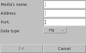
Figure 8: New media details Window
A New media details window must be opened for each media that the user wants to record. However, after the first window which pops up automatically after having filled in the Description field, the user must open other New media details window by choosing the Add media option in the Media menu. Embedded menus are not a viable option if the drop down menu has only one option, as in this case.
Hitting the Return key after filling in the Description field automatically calls up New media details window. The same result is obtained by selecting Add media, from the Media menu. If Return were a shortcut to the next stage throughout the application, then this would be a good feature. As it happens, this is not consistently so. To get a second media box you have to use the Add media menu item.
It is not possible to back track. If a wrong address has been entered, the recorder has to be abandoned a new one set up from the beginning.
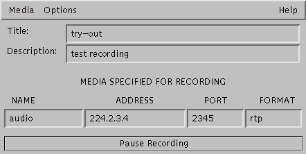
Figure 9: Record Window - while recording
The Hide window option in the Options menu of the Record window does not provide clear feedback on how the window can be un-hidden. Is this function really needed as windows can be minimised under the window system?
As in the player, there is no Stop button.
In the New media details window, the user is allowed to record whiteboard as rtp, though it cannot be played back.
The user is not prompted to select the Set duration option - quite rightly, since it is an option. But it is a useful one and users may want to know it exists. Perhaps a reference in the Help->Recording text would be a good idea.
If it turns out that conferences on certain addresses will be recorded regularly many users would find it useful to be able to keep their own list of such conferences and addresses, and be able to select them by name, and skip the media/address input stage of recording. At present there is a considerable memory load imposed on the user - remembering address/port combinations for all the media.
There is no easy way of assuring that the tool is actually recording, other than checking all the addresses. It might be nice with some kind of visual indication (like the red light on a VCR) when data is actually being recorded.
There is no documentation available for how to use the mmcr apart from the little help windows that can be opened from within the tool.
There are a couple of web pages - one is an installation guide and that other is a FAQ page, but none of them resembles a user guide.
Basic functions that are not supported are: fast forward and rewind. At the moment a conference can only be viewed from the beginning. Once started, it can be paused or rewound right to the beginning. This is extremely unsatisfying. A timer should also be available so it is possible to make references to specific points in the conferences. Being able to ‘bookmark’ certain places would be desirable as well.
Unless the user has a PC where the config files can be changed, mmcr cannot be used for viewing conferences which have been recorded on boom.
The user cannot delete recordings that she has made. And once a recording has been started, it cannot be stopped without saving the recordings. This means that if a user realises that she has typed in a wrong address or port, and has to restart the recording, she has to choose a new name for the recording.
Only machines that can run software for Suns are supported. This seems particularly strange as the application is written in java which is renowned for platform independence.
Some of the problems reported by users who have used mmcr to record conferences as part of their research, are not interface problems. Examples of other problems are:
This has led to faulty recording which in the case of the ReLaTe project has substantially diminished the number of recordings available for analysis. Out of around 30 recordings attempted, only about six are complete. This is due to a number of problems, of which the ones mentioned above, played a part. But, lack disk space and other factors also played a substantial role in the lack of successful recordings.
The evaluation revealed that the tool has some serious usability problems. In fact, one evaluator, despite using other Mbone tools on a regular basis, never managed to play or record anything. The problems can be grouped together into problems relating to: